COVID-19 analysis
Analysis of COVID-19 infection rate by country.
Features
Reading data from external files
Graphics-driven assignments
Try me
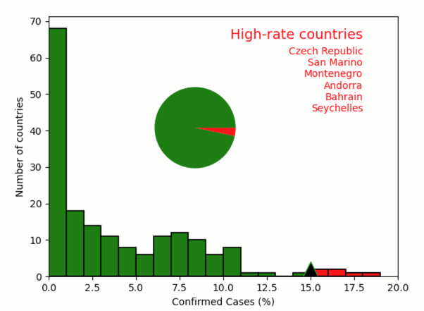
Drag the high-rate threshold (triangle marker)
from pyquibbler import iquib, q, initialize_quibbler
initialize_quibbler()
from matplotlib import pyplot as plt
import numpy as np

%matplotlib tk
# Load data file of COVID statistics per countries
file_name = iquib('COVID_Fatality.csv')  # <-- input

dtype = [("Country", str, 32), ("ConfirmedCases", int), ("Deaths", int),  ("Population", float)]
fatality_table = np.genfromtxt(file_name, dtype=dtype, delimiter=',', names=True)
# Figure setup
plt.xlabel("Confirmed Cases (%)")
plt.ylabel("Number of countries")
plt.axis([0, 20, 0, 70]);
# Calculate and plot histogram of infection rate
rate = fatality_table['ConfirmedCases'] / fatality_table['Population'] * 100
plt.hist(rate, np.arange(0, 20, 1), facecolor='g');
# Threshold high-rate countries
threshold = iquib(15.) # <-- input
above_threshold = rate >= threshold
plt.hist(rate[above_threshold], np.arange(0, 20, 1), facecolor='r')
plt.plot([threshold, threshold], plt.ylim(), 'd--k', markersize=18);
# List high-rate countries
text_props = {'va': 'top', 'ha': 'right', 'color': 'r'}
plt.text(18, 68, 'High-rate countries', fontsize=14, **text_props)
plt.text(18, 63, q("\n".join, fatality_table[above_threshold]['Country']), **text_props);
# Plot pie chart
totals = np.array([np.sum(~above_threshold), np.sum(above_threshold)])
ax = plt.axes([0.2, 0.5, 0.3, 0.3])
plt.pie(totals, colors=['g', 'r'], labels=totals);